What Topics Are Common to Hate Speech on Twitter?

Below is a report I wrote analyzing the content of hate speech posted to Twitter. I employ a machine learning algorithm to model the topics present in the body of text which prove diverse in nature and focused unsurprisingly on marginalized groups. The modeling is somewhat imprecise, but it is shared to showcase an interesting method of studying online hate speech. The original version can be found on my GitHub.
CONTENT WARNING
The following assignment focuses on online hate speech, which is often racist, misogynistic, ableist, and basically harmful to many people. If seeing this content offends you, please read no further.
Overview of our Data
Online hate speech leads to real world violence. In the United States, various groups – from racial and sexual minorities to overweight people – are regularly targeted and shamed by trolls, and internationally, rising hate speech has been a precursor to multiple genocides. Hate speech is an ongoing and pressing policy problem for many countries around the world; understanding the types of content put out by speakers of hate is crucial to addressing their harm.
In the spirit of this endeavor, I use Latent Dirichlet allocation (LDA) to analyze the topics present in a large data set of hate speech on Twitter. LDA is a form of unsupervised machine learning which assumes documents are a mix of hidden (latent) topics found across the whole corpus; it traces from particular tokens and documents back to the corpus’s overall topic structure, revealing associations that may point to independent themes.
Here I apply this method to Thomas Davidson’s open source sample of potential Twitter hate speech. As the GitHub explains, he scraped more than 20,000 Twitter posts that used language found in Hatebase’s hate speech lexicon and employed a team of research assistants (RA’s) to manually code said posts into one of three categories: hate speech, offensive language, or neither.
Below I explore the posts coded as “hate speech”. I originally intended to perform topic analysis on posts where the RA’s determinations were divided vs. in consensus and then on hate speech vs. offensive language (the posts that were not hate speech), but separate obstacles impeded each of those efforts, inducing me to narrow my focus to hate speech generally. I elaborate on these decisions below, but first – our data.
# download .csv from GitHub
url <- "https://raw.githubusercontent.com/t-davidson/hate-speech-and-offensive-language/master/data/labeled_data.csv"

download(url = url, destfile = ("labeled_data.csv"), quiet = TRUE)

# code a "consensus" variable communicating whether the RA's were unanimous in their decision
hs_data_clean <- read_csv(here("labeled_data.csv")) %>%
  mutate(consensus = if_else(
    (count == hate_speech | count == offensive_language | count == neither),
    TRUE,
    FALSE)) %>%
  select(class, tweet, consensus)

# convert numeric values in the class column to the full category name
class_clean <- hs_data_clean$class %>%
  str_replace("0", "hate speech") %>%
  str_replace("1", "offensive language") %>%
  str_replace("2", "neither")

hs_data_clean <- hs_data_clean %>%
  mutate(class = class_clean)
Above we download and clean small aspects of our data. Overall, it is high quality; there are no missing tweets in any of the observations. I coded a consensus variable to indicate if the multiple RA’s which labeled each tweet were in agreement regarding that label (which as we will find later was not usually the case) and made the class column more explicit with its name. The remainder of our analysis focuses initially on consensus and class and then on the tweets themselves.
Here is an example of a tweet from each category:
hate speech: “Halloween was yesterday stupid n_gger”
offensive language: “You ever f_ck a b_tch and she start to cry? You be confused as sh_t”
neither: “As a woman you shouldn’t complain about cleaning up your house. As a man you should always take the trash out…”
As one can see, all of these tweets are obscene, though not all hate speech. Let us conduct a bit of exploratory analysis about this labeling and then perform our topic model analysis.
Exploratory Analysis
We are dealing with three variables here: consensus, class, and tweet. The labeling of “hate speech” vs. “offensive language” is crucial for this analysis, so we will briefly dig into the patterns of content labeling. First, I explore the share of content in each category.
# show proportion of tweets that were determined by consensus or with disagreement
hs_data_clean %>%
  count(consensus) %>%
  mutate(prop = n / sum(n), # mutate a proportion and percentage
         percent = round(prop * 100)) %>%
  kable(format = "simple", # show as kable
        col.names = c("Consensus", "Count", "Proportion", "Percent"))

# show proportion of tweets in each category of content
hs_data_clean %>%
  count(class) %>%
  mutate(prop = n / sum(n), # mutate a proportion and percentage
         percent = round(prop * 100)) %>%
  kable(format = "simple", # show as kable
        col.names = c("Content Type", "Count", "Proportion", "Percent"))
Interestingly, the vast majority of tweets that use language characteristic of hate speech are NOT actually hate speech. Specifically, about 6 and 77% of content were coded as hate speech and offensive language, respectively, with the rest as neither.
And further complicating this labeling practice, the vast majority of RA determinations (~71%) saw at least one dissenting vote (that is, a majority of RA’s voted one way, but at least one coded a tweet differently). It seems classifying hate speech from other forms of obscene content is not as simple as it may seem; let us consider the distribution of consensus and divided determinations by content category.
# show proportion of consensus and divided determinations by tweet category
hs_data_clean %>%
  group_by(class) %>%
  count(consensus) %>%
  mutate(prop = n / sum(n), # mutate proportion and percentage
         percent = round(prop * 100)) %>%
  kable(format = "simple", # show as kable
        col.names = c("Content Type", "Consensus", "Count", "Proportion", "Percent"))

# visualize table as bar graph
hs_data_clean %>%
  ggplot(aes(x = class, fill = consensus)) +
  geom_bar(position = "fill") +
  labs(
    title = "Consensus and Divided Determinations by Content Category",
    x = "Content Category",
    y = "Proportion of Determination",
    fill = "Determination"
    ) +
  scale_fill_brewer(palette = "Set3") +
  theme_dark()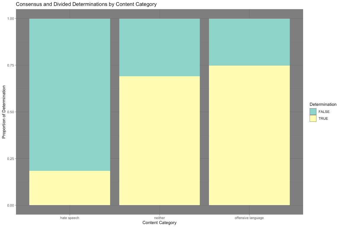
The bar chart above tells us something very interesting: the vast majority of hate speech determinations were divided. More than 80% of all hate speech determinations were divided, compared with the 31 and 25% of neither and offensive language. It seems that hate speech determinations are not cut and dry. This suggests that topic distinctions between categories are not as obvious as one might expect. I analyze the topics coded as hate speech below.
(My initial inclination here was to be comparative, that is, perform LDA topic modeling on hate speech with divided vs. consensus determinations and then hate speech generally to offensive language. However, the sample of consensus hate speech was too low (~280 tweets) to make the former feasible, and the latter was too labor and computationally intensive. I leave the exploratory analysis above as context for my topic analysis!)
Digging Deeper
To model the latent topic structure of tweets containing hate speech, I used LDA with multiple numbers of topics to algorithmically determine thematic groups. I picked the “best” model, that is, the one with the lowest perplexity score (a statistical measure of the model’s accuracy) and then visualize the top 5 words associated with 30 of the topics. I analyze patterns in the recognizable topic grouping and then conclude with major takeaways as well as where my analysis could go from here. (I will certainly circle back to this.)
Below I filter the data set for observations coded as hate speech and then define a function to create and then apply a recipe which returns the data tokenized into n-grams (1 through 4) and in document-term matrix format as required by the LDA algorithm. (My analysis was written using multiple defined functions to originally be applied across multiple subsets of the overall data. Even though I am only taking one subset, I leave the code as a function so that I may use it on other subsets in the future.)
# filter tweets for hate speech
hs_tweets <- hs_data_clean %>%
filter(class == "hate speech") %>%
  select(tweet)

# define a function to create and apply an LDA to our data then reformat for fitting
create_and_apply_rec <- function(df) {

  LDA_rec <- recipe(~ tweet, data = df) %>%
    step_sample(size = 1e04) %>%
      # take sample of 1,000 posts; eases computation
    step_tokenize(tweet) %>%
      # break down tweets into tokens; initially individual words
    step_stopwords(tweet) %>%
      # filter tokens for stop words
    step_ngram(tweet, num_tokens = 4, min_num_tokens = 1) %>%
      # create all possible 1- through 4-grams as terms for our analysis
    step_tokenfilter(tweet, max_tokens = 2500) %>%
      # filter for the 2,500 most frequent terms
    step_tf(tweet)
      # identify each term's frequency in each document

  # prepare and bake the recipe; mutate a unique identifier (id) for each term
  transformed_df <- prep(LDA_rec) %>%
    bake(new_data = NULL) %>%
    mutate(id = row_number())

  # pivot into tidy format for filtering and casting back into document-term matrix format
  final_dtm <- transformed_df %>%
    pivot_longer(
      cols = -c(id),
      names_to = "token",
      values_to = "n"
    ) %>%
    filter(n != 0) %>%
      # remove tweets that did not retain any tokens after applying the recipe
    mutate(
      token = str_remove(string = token, pattern = "tf_tweet_")
    ) %>%
      # remove character introduction to tokens
    cast_dtm(id, token, n)
      # convert back into document-term matrix format

  return(final_dtm)
}

# apply recipe to data and save as document-term matrix
hs_dtm <- create_and_apply_rec(hs_tweets)
With the recipe applied, we can now fit a couple of example LDA models to the data and find their perplexity score!
# fit dtm to LDA model with 4 topics; calcuate perplexity score
hs_lda4 <- LDA(hs_dtm, k = 4, control = list(seed = 123))

perplexity(hs_lda4)
## [1] 704.5521
# fit dtm to LDA model with 12 topics; calcuate perplexity score
hs_lda12 <- LDA(hs_dtm, k = 12, control = list(seed = 123))

perplexity(hs_lda12)
## [1] 551.3402
At least for these two examples, the perplexity score decreases as the number of topics increase from 4 to 12 (from 714.2764 to 543.9632). Again, this decrease tells us that the model is becoming more accurate at modeling the actual topic structure of the corpus. To find the most optimal k value, below I create two functions to loop through multiple values of k and visualize their perplexity score.
# define a function to iterate through and visualize the perplexity score of various k values

  # create an iterable character vector to set k values
n_k <- c(2, 4, 20, 50, 100)

create_models <- function(folder, save_file_name, n_topics, lda_dtm) {
    plan(multisession)
      # determine process mode (i.e. parellel or not)

    lda_compare <- n_topics %>%
      future_map(LDA, x = lda_dtm, control = list(seed = 123))
    # iterate the creation of LDA models with multiple values of k using map()

    save(lda_compare,
      file = here("models", folder, save_file_name))
    # save to the list of models and a document to the specified folder

    return(lda_compare)
  }

hs_lda_compare <- create_models("hate speech", "hs_lda_compare.Rdata", n_k, hs_dtm)

# define a function to visualize the perplexity scores of the iterated LDA models
visualize_perplexity <- function(n_topics, models) {

  # create a tibble of k values mapped (in both senses) to their perplexity scores
  tibble(
    k = n_topics,
    perplex = map_dbl(models, perplexity)
  ) %>%
  # visualize the tibble as a line graph
      ggplot(aes(x = k, y = perplex), show.legend = FALSE) +
      geom_point() +
      geom_line(color = "#8ED3C7", size = 2) +
      labs(
        title = "Perplexity Scores of Hate Speech Topic Models",
        subtitle = "Most optimal is lowest",
        x = "Number of topics",
        y = "Perplexity Score"
      ) +
    theme_dark()
}

visualize_perplexity(n_k, hs_lda_compare)
The plot above demonstrates that the most optimal model is the fifth, k = 100. While the decrease in perplexity score significantly slows after k = 20, 100 topics best fits the latent structure of the data. Therefore, I visualize the top 5 words associated with the first 36 topics (represented using three ggplot bar graphs). I then make some observations about the topics.
Onto the final set of visuals!
# define a function to visualize most common words associated with the topics in our best model
visualize_top_terms <- function(lda_compare, best_model, n_1, n_2) {

# extract our selected model and convert to a tidy data frame
lda_td <- tidy(lda_compare[[best_model]])

# identify the topic 5 words associated with each topic
top_terms <- lda_td %>%
  group_by(topic) %>%
  top_n(5, beta) %>%
  ungroup() %>%
  arrange(topic, -beta)

# filter for specified topics and mutate data for presentation
top_terms %>%
  filter(topic >= n_1 & topic < n_2) %>%
  mutate(
    topic = factor(topic), # factorize topic
    term = reorder_within(term, beta, topic)
  ) %>%

# visualize as bar graph
ggplot(aes(term, beta, fill = topic)) +
  geom_col(alpha = 0.8, show.legend = FALSE) +
  scale_x_reordered() +
  facet_wrap(~topic, scales = "free", ncol = 3) + # facet by topic
  coord_flip() +
  labs(
        title = "5 Words Most Associated with Topic",
        subtitle = "Word associations help us identify the topic",
        x = "Topic",
        y = "Most Associated Words"
      ) +
    scale_fill_brewer(palette = "Set3") +
    theme_dark() # #darkisbesttheme
}

# visualize first dozen topics
visualize_top_terms(hs_lda_compare, 5, 1, 13)
#visualize second dozen topics
visualize_top_terms(hs_lda_compare, 5, 14, 25)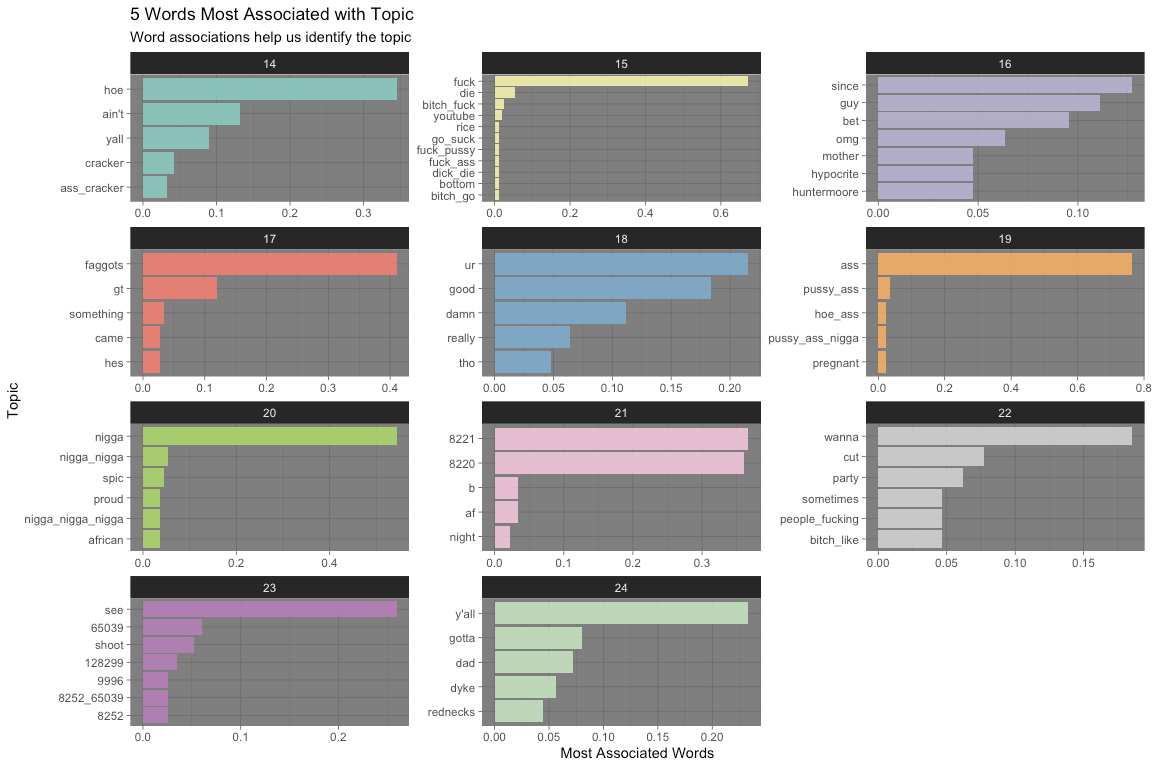
#visualize third dozen topics
visualize_top_terms(hs_lda_compare, 5, 26, 37)
The above plots can tell us many things about hate speech on Twitter. Please, refer to the topic catalog for a list of my interpretation of the 36 topics visualized above. These interpretations will no doubt be suspect and very well even subjective. The LDA algorithm is also very spotty; many, perhaps the majority, of topics are not intelligible to me. In spite of these limitations, I list the 10 most notable here:
2 - deriding the appearance of East Asian people
4 - deriding LGBTQ+ people who have families and children
5 - taking a “stand” against Jews
8 - expressions of humor about violence and rape of vulnerable groups
14 - deriding the appearance of Hispanic people
15 - inability for others to “act white”
16 - calling Americans white trash
19 - calling black people n*gger
22 - make fun of women, especially calling them a b*tch
34 - comparison of women’s appearance to a dog
36 - comparing appearance to "d*ke" stereotype
Many groups are represented on this list. Reflecting prior research on Twitter’s hate speech, the majority of intelligible topics are racial in nature – from making fun of Asian and Hispanic people’s appearance to calling black people the n-word. Interestingly, there is also a topic that uses the term “white trash,” which is more classist in nature. Derogatory statements about women are also very common.
A common theme across groups was deriding people’s appearance. Perhaps this reflects the visual nature of the Internet, but racial minorities and women had their appearance compared to stereotypes (like “looking” Mexican or similar to a d*ke) or even dogs. A more unique category of content was the topic about LGBTQ+ people and Jews.
Conclusion
Online hate speech targets people from diverse backgrounds. There are significant limitations to this analysis: the difficulty of categorizing hate speech, the lack of time and computational capacity, the unintelligibly of many topic groups. However, I was still able to model discrete topics that raise interesting questions for my future exploration. I am personally fascinated by the Internet, especially its governance of speech content. I will definitely circle back to revise and refine my approach!